The saying “A picture is worth a thousand words” is so well-known, it has become a cliché. But that doesn’t negate how true it often is. Photographs, paintings, animations, and all kinds of art can evoke an emotional response from a viewer more quickly and powerfully than words alone. When designed with intent, images can communicate the indescribable, imbue feeling, make confusing information digestible, reveal hidden or double meanings, and entertain or dazzle us.
The same holds true for visual representations of complex concepts or data in online learning. Whether you’re looking at a diagram, a chart, an image, or a graphic, somewhere behind it is a designer who made a series of decisions regarding how best to communicate important information to the learner using visuals rather than text. If successful, the final visual will clearly communicate the most salient points of the depicted information and take hold in the viewer’s memory. As such, visual representation is a crucial component of creating a more effective, richly engaging experience for learners.
How and Why Visual Representation Works
Whether you’re a designer or someone within an organization who’s looking to create a digital learning experience, you can benefit from taking a deeper dive into how and why humans process visual information the way they do.
A Studion Media Producer has a lot of experience with visual representation, a term that she defines as anything visual that’s placed in front of you to convey a message or story. She says, “We see the image or graphic, we take it in, and then our brains begin to process and interpret it in our working memory by calling upon preexisting ideas and mental models we have stored in our long-term memory.” At that point, the learner begins to think actively about what they’re looking at and draw conclusions about it.
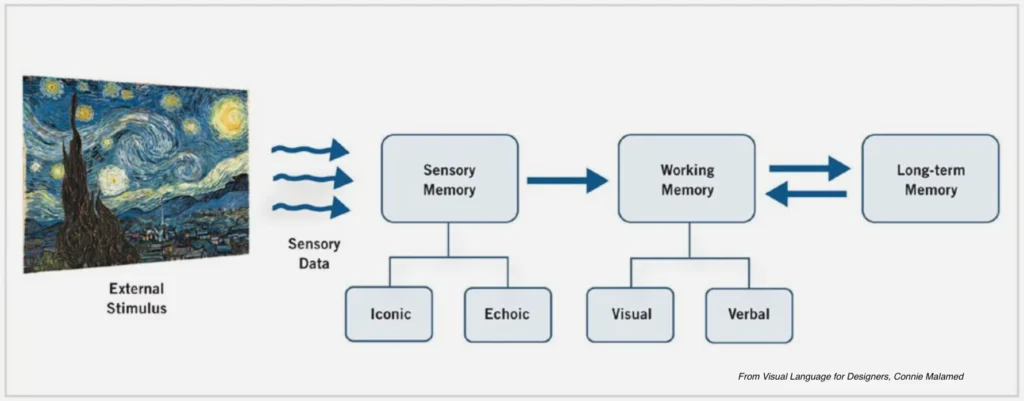
This may seem like a simple, typical response, but this process, known as the human information-processing system, is actually quite involved. To think actively and draw conclusions about visually presented data, the learner needs to use their working memory, which allows a person to keep a small amount of information in the brain in an easily accessible way. But they usually can do this better if elements within a given graphic refer to ideas or concepts that are already present in their long-term memory. When designed with intent, a graphic can actually cue the brain to retrieve concepts from its long-term memory, thereby easing the cognitive load needed to process the new information.
This is why a Studion Media Producer likes using the example of building a house to explain a complex concept. “If I need to explain a detailed process and want to communicate how each phase is different, why the phases need to be completed in a specific order, and that some phases are more critical than others, I might make use of a house analogy. I’d explain that first you develop blueprints, then you build the foundation, install plumbing and electricity, and add drywall and flooring. Once all of those things are finished, you can add a patio, cabinets, and wallpaper. Then, relying on this analogy, I can explain how part X of the process is like adding in drywall, whereas part Y is like putting up wallpaper. Drywall must be installed before wallpaper can even be considered, and drywall is more important than wallpaper because the house cannot function without drywall, whereas it can function without wallpaper. I’m making it easier for your working memory to make sense of this new, complicated process by mapping it to a very familiar schema you already have stored in your long-term memory.” Because visual representation works through identifying and directing a learner’s cognitive and emotional processes to impart information, it’s most successful if each learner can tie the visual to both kinds of memory.
Note that visuals and graphics are powerful tools in your toolkit only if you’re clear on what you want to convey and the most effective way to convey it.
Once those things are determined, the graphics can be created with them in mind, giving learners the best chance of absorbing everything they’re being taught.
Also, it’s important to remember that the rationale behind using graphics or images rather than text is to make a point or share knowledge in a way that clarifies and elucidates that point or knowledge. In other words, the visual should offer the learner something that a text-only explanation cannot.
Organizing and Maximizing the Impact of Your Graphics
In order to produce effective graphics, it is essential to first understand gestalt principles and how they can be wielded. The idea behind these principles came out of the field of gestalt psychology, which emerged with three German psychologists in the early 20th century. The German word gestalt means “shape,” “form,” or “unified whole,” and in general terms, the field focuses on how humans make meaning from the chaos around them. Opinions differ regarding the exact number of gestalt principles (some say six, some seven, some as many as 10), but basically they cover the same single topic: how the brain organizes the visual content it perceives. When there are complex scenes happening, what does the mind do to sort and categorize the elements of those scenes in order to interpret them?
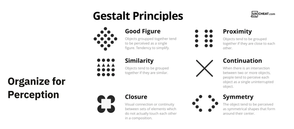
The main gestalt principles are:
- Figure-ground articulation
- Proximity
- Common fate
- Similarity
- Symmetry
- Continuity
- Closure
Making use of these principles is key to impactful design, whether it’s a learning platform or a logo.
You don’t want the learner to spend a long time trying to decipher what they’re looking at, and that means thinking through your images and graphics every step of the way.
As the Media Producer says, “You need to actually consider how people learn and not how you wish they’d learn. Because the average attention span is eight seconds, you need to use certain types of grouping and emphasis to help people reach the intended conclusions really quickly. It requires you to be both insightful and clever.”
As a designer, you should prioritize organizing content for perception. Especially when designing content for learning experiences, remember that part of your job is to control how the viewer looks at and processes a visual. To learn the best ways to do this, Savannah recommends turning to Connie Malamed’s book Visual Language for Designers, which she views as the holy grail of visual representation.
In her work, Malamed suggests applying the following heuristics:
- Add motion to your graphic. This literally directs the eye to what it needs to follow in order to get the relevant information.
- Direct attention through use of color. Remember, however, that people from different cultures interpret color in different ways (e.g., the use of red as the main color for weddings in China versus white in the U.S.), so you need to take that into account.
- Reduce realism. “People are often surprised by this one, but the idea is that you can only remember so much in your working memory,” says Studion. If the learner is confronted with too much information in a visual, they may get distracted and stop learning.
- Make the abstract concrete. Abstract ideas and concepts are often easier to understand if they’re tied to something well-known; remember the house example from earlier?
- Break down complicated ideas into smaller pieces. Like reduced realism, this prevents the learner from getting overwhelmed.
- Clarify complexity. A familiar example of this is the way IKEA writes their directions for assembling furniture: entirely as simple images. They’re a step up from stick-figure drawings, but they’re very basic, genderless illustrations of a person putting the pieces of each furniture item together. This approach works in multiple countries because the steps are simplified, but accurate, versions of the process.
- Don’t forget about emotional salience. As Studion points out, this has a direct and significant impact on the learner’s ability to understand and retain information. “If people experience an emotional connection to something, they are more likely to recall the details of it,” she says. “When they have an emotional response, they’re learning more actively.”
- Composition, symbolism, narrative, and humor are other elements of visual representation, as is surprise. “When you’re surprised by something, you’re more likely to remember it,” Studion says. “So it’s a really important way to engage the learner and help them commit something to memory. I will always remember how potassium reacts to water after watching my science teacher create a massive explosion by throwing a chunk of it into my school’s pond.” These elements may not be appropriate in every situation—humor can be an especially tricky tool to use in many contexts—but it’s always worth exploring.
What This Means for Your Organization
So, has your organization been making the most of your visuals? Every website uses some sort of graphics, whether they’re ostensibly to teach people something or to trigger an emotional response. Every so often you should review whether the visual elements of your design are working hard enough for you.
“A creator’s job is not to make things pretty but to make them compelling,” Studion says. “I think that’s an immediate misconception people have, because successful graphics often rely heavily on the viewer’s senses and subconscious. Every element of a visual serves as an opportunity to communicate and clarify something to the viewer, especially when these techniques are applied. It’s worth spending the time and investing in.
Our value as a company, especially when it comes to learning design, lies in creating content that helps somebody understand something they didn’t or couldn’t understand before.
As American statistician and data visualization pioneer Edward Tufte said, “Good design is a lot like clear thinking made visual.” That should be the end goal of all visual representations of data: an image, graphic, or design element that clearly shows the information you want to share.